
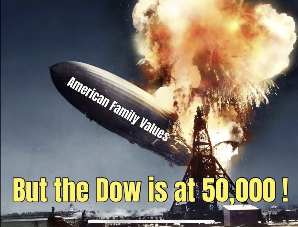
In early February 2026, the Dow Jones Industrial Average (DJIA) etched a new chapter in financial history, briefly surging past the unprecedented 50,000-point mark . For many American investors, this milestone is a cause for celebration and a signal of economic vitality. However, a closer look at what the Dow actually represents—and what’s happening beneath the surface of the broader economy—suggests that this record-breaking number may be dangerously misleading for the average American trying to gauge the nation’s financial health.

What is the Dow, and What Does 50,000 Really Mean?
To understand why the Dow’s record high might be deceptive, we first have to look under the hood at how this index is built. Unlike the S&P 500, which reflects the overall market value of 500 large companies, the Dow is a price-weighted average of just 30 stocks . This means that companies with a higher per-share stock price have a vastly disproportionate influence on the index than those with a lower price, regardless of the company’s actual size or importance to the economy.
As of its climb past 50,000, the Dow’s composition illustrates this quirk perfectly. UnitedHealth Group and Goldman Sachs Group are consistently among the heaviest weights due to their high stock prices, while corporate behemoths like Walmart—despite being worth hundreds of billions more—have a much smaller footprint in the index because its share price is lower . So, when you see the Dow hit 50,000, you are largely seeing the performance of a few high-priced tickers, not necessarily the broad health of American business.

The recent milestone was powered by a familiar force: artificial intelligence. While the Dow is less tech-heavy than the Nasdaq, it still includes giants like Nvidia, which was added to the index in late 2024, alongside Microsoft and Amazon . A surge in these stocks, driven by AI optimism, can mathematically lift the entire index, even if other sectors are struggling.
The Flawed Index vs. The Real Economy
The core issue is that the Dow’s methodology makes it a poor barometer for the average American’s economic reality . While the index celebrates nominal records, several economic indicators are flashing yellow or red.

· A Narrow View of the Market: By covering only 30 companies, the Dow misses the struggles of thousands of other publicly traded firms. Recently, while the Dow was flirting with 50,000, a sudden and aggressive selloff hit sectors that are far more sensitive to day-to-day economic activity. Trucking firms, commercial real estate, and financial services stocks experienced sharp declines—some approaching 20% . These are the industries that usually feel the pinch first when the economy tightens, and their pain tells a different story than the Dow’s gains.

· The “Magnificent Seven” Mirage: The S&P 500, often considered a better benchmark, has also faced criticism for being overly concentrated in the “Magnificent Seven” tech stocks. The Dow’s price-weighting actually underrepresents some of these names, but it doesn’t make the index healthier . It simply means the high-flying 50,000 figure is a mathematical function of a handful of stocks, not a vote of confidence in the other 27 components.

The “Vibe-cession”: Why Americans Don’t Feel the Rally
This disconnect between record-high indices and public sentiment has been dubbed by some economists as a “vibe-cession.” Americans are looking at their grocery bills, their housing costs, and their job security, and they are seeing something very different from the Dow Jones chart.
Recent market analysis shows a worrying trend: defensive positioning. In mid-February 2026, despite positive labor data, bonds began outperforming stocks as investors fled to safety . This suggests that the “smart money” is hedging against a downturn, even as headline indexes hover near all-time highs.

Recession Indicators That Aren’t Wrong
While the Dow screams “bull market,” historically reliable recession indicators are murmuring a warning. Despite the index reaching 50,000, recession forecasting tools that have been accurate for decades are pointing to trouble ahead.
One of the most respected tools is the Federal Reserve Bank of New York’s recession probability model, which analyzes the yield curve. As of May 2025, it projected a 30.45% chance of a U.S. recession by April 2026 . Historically, whenever this probability has climbed above 32%, a recession has followed. While this is a probability, not a certainty, it stands in stark contrast to the certainty often implied by a surging Dow.

Furthermore, the Conference Board Leading Economic Index (LEI) recently recorded one of its steepest declines since its inception. While it technically broke its perfect recession-calling streak recently, such dramatic drops in the LEI have almost always been associated with significant economic weakness . Add to that the fact that the M2 money supply has seen its first meaningful decline since the Great Depression—a contraction that has historically correlated with severe economic downturns—and the picture becomes murkier .
Conclusion
The Dow Jones hitting 50,000 is a remarkable psychological milestone. However, it is a number built on a century-old, flawed methodology that bears little resemblance to the structure of the modern American economy . It is currently inflated by a handful of AI-driven stocks, masking significant turmoil in economically sensitive sectors like transportation and real estate .

For Americans trying to navigate their financial futures, the Dow may be the wrong map to follow. While Wall Street celebrates price-weighted averages, Main Street is experiencing the weight of high interest rates, contracting money supply, and the lingering threat of an inverted yield curve . The Dow at 50,000 might be a great headline, but it is a dangerous tool for measuring the true health of the U.S. economy.